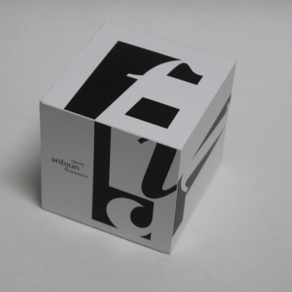


Type Cube
Objective: Create a three dimensional black and white cube that reflected some aspect of the designer’s life using only type.
Concept: The cube was designed using the designer’s name and the confusion surrounding how to pronounce it. This worked out well since the name has exactly 6 letters which relates to the 6 panels. 2D represents the name on paper and the confusion on how it is pronounced along with how people just skim over the name and do not attempting to pronounce it correctly or get to know the person behind the name. The 3D cube represents the designer as a person as you have to interact with the cube with the lines pushing you in the correct direction. By interacting with the cube, the viewer is interacting with the person and learning who is behind the name.
Featured in Auburn University’s 2016 Graphic Design Juried Show // Juror Ann Willoughby
Featured in Wallace Hall Exhibit 2017